I think the CDC does an effective job of capturing information from the various guides in collecting posters. The documents are informative but contain detailed information on different topics regarding the Coronavirus pandemic.
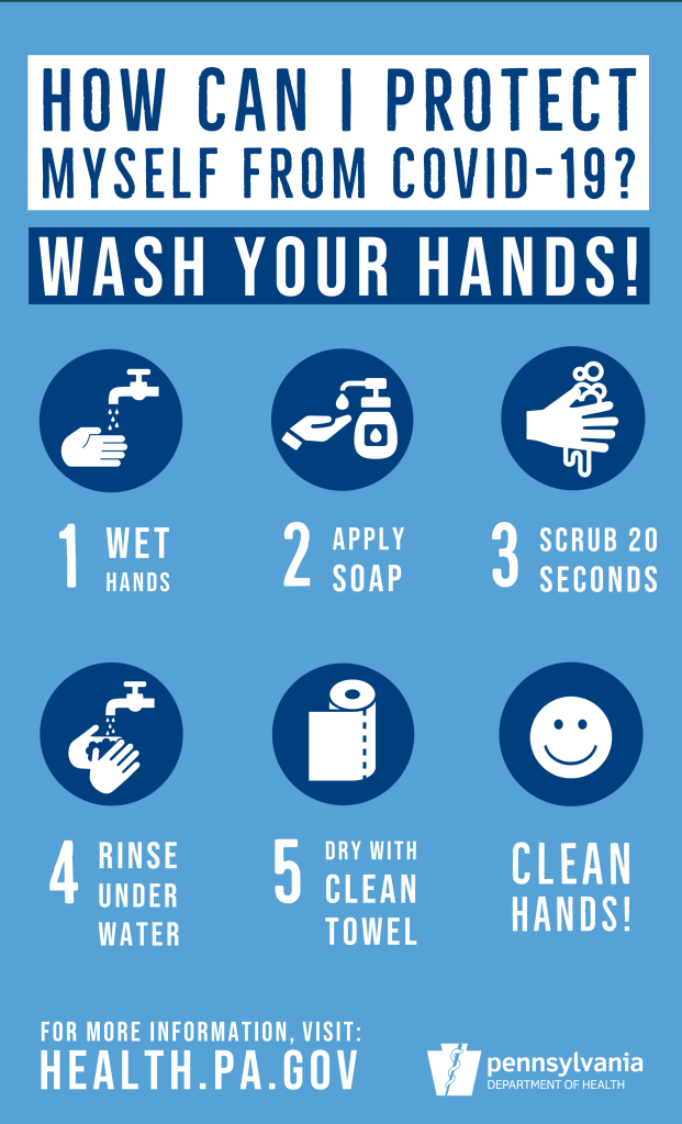
The posters break down the primary, critical topics like proper hand washing, correct mask usage, and practices on protecting yourself and others around you. Within these posters, the CDC further breaks down the information into different visuals and smaller sections.
These informative posters are formatted in an inverted pyramid structure, and this is a successful composition because people can get the essential information easily and focus on the main points. The information is easier to understand and remember when presented in the inverted pyramid format, and you do not have to spend a lot of time reading minuscule details.
Both these posters achieve balance in the way the elements on the page were laid out. The second poster, discussing protecting yourself and others from Coronavirus, utilizes sequence, especially in the second line with all the different color boxes. This use of sequence with different colors and different peoples really makes the page pop visually. The sequence also comes into play with the mask-wearing poster because the elements at the top of the page have the most prominence.
The mask-wearing poster displays unity effectively because the illustrations are similar in style and the body and display fonts complement each other nicely. The font was consistent and readable in both posters, especially in protecting yourself and others from Coronavirus one.
These posters are both effective and strong. They are informative and easily readable. The only criticism I had was the poster dealing with protecting yourself and others from Coronavirus was busy in terms of all the different colors they used. I found it a bit distracting. The flow was stronger on the hand washing poster in terms of the way it was formatted in the grid style.